
Color Trends in Ceramics and Home Decor -2026 Inspiration Guide 🎨
2026 is shaping up to be a year where color tells a story — one that blends nature-inspired tones, emotional warmth, and expressive palettes. Whether you’re designing ceramics or styling your living spaces, this year’s color trends are about connection, personality, and dimensional aesthetics.
🌊 Transformative Teal & Blue-Greens — Calm Meets Expression


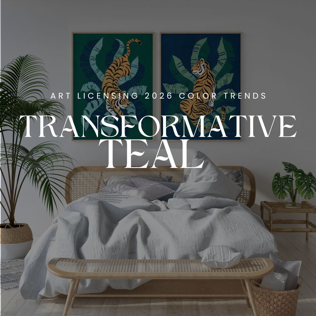
Cool, fluid hues that blend blue and green — like Transformative Teal — are set to dominate 2026 interiors and ceramics alike, bringing balance, serenity, and a touch of bold modernity to spaces. Designers describe these rich blue-green shades as reflecting shifts in lifestyle and emotional expression in interiors. Homes and Gardens
How to use it in ceramics:
✅ Glossy or matte teal glazes for vases, plates, and tiles
✅ Accent tones in mixed sets or coordinated dinnerware
Styling tip: Pair with warm, earthy neutrals — terracotta and clay tones — for contrast and balance.
🌿 Earthy Foundations — Terracotta & Natural Clay


Nature continues to anchor 2026’s palette with earthy terracottas, warm clay tones, and deep moss greens. These colors evoke tactile warmth and grounded comfort in both decor and handcrafted ceramics. the decorholic+1
Where you’ll see it:
✨ Matte ceramic flowerpots and bowls
✨ Warm terracotta accents in living rooms
✨ Earth-toned wall tiles and pottery
Color psychology: These tones foster a cozy, inviting mood — ideal for kitchens, dining areas, and communal spaces.
☁️ Soft Neutrals & Universal Backdrops

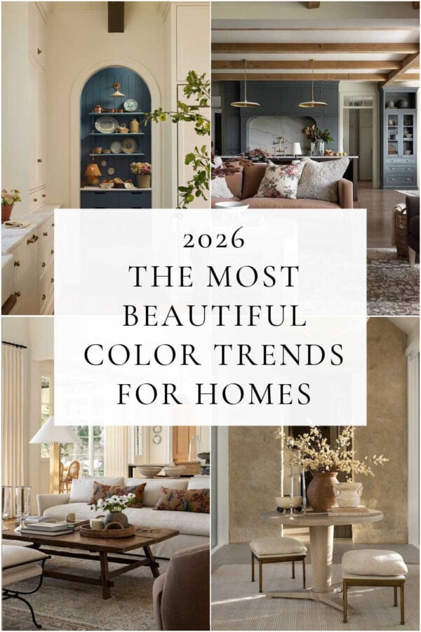
Not all color trends are loud — in 2026 subtle neutrals anchor the bolder hues. Soft stone, warm khaki, and off-white base tones create serene canvases for décor and ceramics collections. blog.decorativematerials.com+1
Palette picks:
🟡 Universal Khaki — mid-tone grounding neutral
⚪ Cloud Dancer — airy, versatile off-white
🌰 Warm taupes and creamy beiges
These neutrals help balance vibrant accents and make ceramic pieces stand out without overwhelming a room.
🌸 Pops of Vibrant & Emotional Hues
While grounded earthy tones dominate, designers also recommend strategic pops of warmth and brightness — mustard yellow, coral accents, and rich rust evoke emotion, joy, and contrast. Better Homes & Gardens
Use these colors in:
🎨 Decorative ceramics (bowls, vases, sculptural pieces)
🪞 Accent walls or artwork complementing tabletop ceramics
🛋 Pillows and textiles that echo ceramic tones
These brighter shades make spaces feel expressive without overwhelming the calming base palette. Better Homes & Gardens
🏠 Trend Takeaways for 2026
🎨 For Ceramic Artists & Makers
-
Embrace mix & match color stories — pair earthy terracotta with teal highlights.
-
Experiment with finishes: matte for modern minimalism and glossy for vibrant accents.
-
Tap into personal expression by blending natural tones with unexpected pops of color.
🛋 For Home Decor Enthusiasts
-
Use soft neutral backgrounds to elevate handmade ceramics.
-
Introduce contrast with rich hues — deep greens, fiery rusts, or warm golds — in small groupings.
-
Let nature-inspired colors drive your decor choices to create spaces that feel both grounded and alive.
2026 is the year color finds balance — between earthy warmth, soulful expression, and serene sophistication. Whether you’re glazing your latest collection or accessorizing your living room, these trends invite creativity and emotional resonance into every inch of your space. the decorholic